Yesterday marked the debut of our brand new website. This is the third complete iteration of our site – and hopefully the best so far.
We originally decided back in 2015 that our old site, which we’d built in-house in 2011 first as a collection of static HTML pages then in 2013 rewrote into a semi-modular php template system, wasn’t up to scratch anymore. At the time, we’d looked to outsource the design and implementation of the site so that we could focus on what we do best: publishing great books and comics. Alas, it wasn’t to be, and by the end of 2016 we’d decided to bring development in-house again. As it was a task that would require quite a bit of time for us to complete we put it on the back burner until August this year when we were able to lock in many of the features and design choices that we wanted to implement.

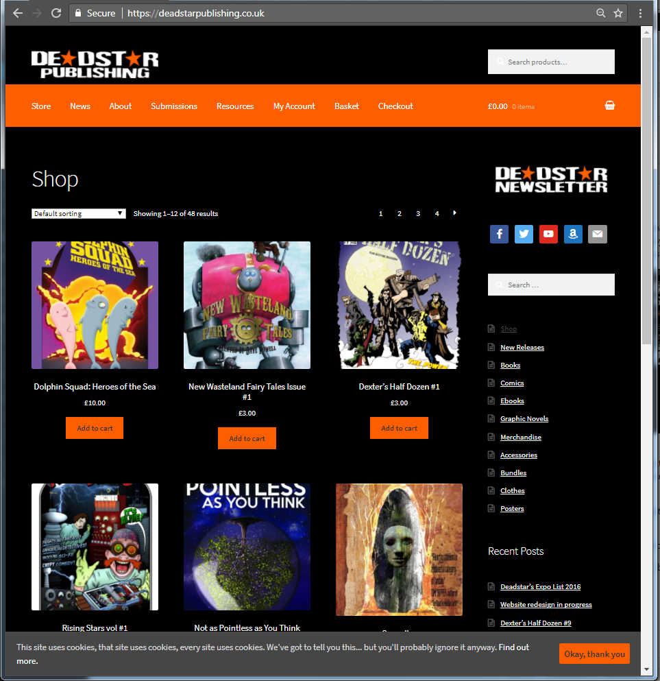
Above, you can see our old design… and it’s one that we really liked at the time. It had a lot of issues though – firstly, the homepage was information about us… which is great… but from looking at our site analytics we found that most people who entered the site via the homepage would read it then leave. However, if they entered the site from our Submissions page or our Store then they were much more likely to either contact us, or buy something from us. With that in mind, we’ve changed the homepage into the store so that more people can see our products.
Another issue we had was that there were too many options for pages within the site… and a lot of the pages either contained duplicate information… or it was out of date. On the top menu alone there were 9 options to choose from (and there were buttons on the left and right of the screen as well as a second menu at the bottom of the screen. Far too many options!). We’ve now reduced that to 5 (plus your account, basket and checkout buttons) which means the site is easier to navigate.
On top of that, when the old site was written, phones and tablets were used far less for internet browsing so we never really optimised our site for mobile web users. That has changed and our site is now responsive based on your connection and screen size.
We’ve also taken the opportunity to update our logo. Danny did a fantastic job when he designed the Deadstar Publishing nameplate in 2010… but over time we’ve begun to see its limitations – the transparent eroded and damaged letters don’t always hold up well against different colours so we came up with the slightly simplified two-tone version that we’re using across all of our titles from now on.
All of that has lead to the following:
I hope you’ll agree that the new site looks a lot cleaner than the old one. It’s easier to navigate and more clearly displays our products and their categories. It also does two other things that the older version never did: we’re now compliant with recent EU and UK legislation requiring websites to advise their customers about the use of cookies. Another detail is that we’ve moved over to SSL technology to secure your information even more.
It hasn’t been the smoothest of moves though – originally we had planned to make the new site live on Tuesday 19th September… and when we started the process of migrating data from our test server… something went wrong. Fortunately, we have some very good, clever and nice friends, and Mark Chatterley, the big cheese behind In Ear Entertainment (who incidentally produced and sell our audiobook for Not as Pointless as You Think) was able to help us recover and ensure our work over the past few months didn’t go to waste.
Now that our new site is up and running, there’s still a bit of tinkering to do… but for now, happy browsing!
[…] been around for almost 14 years and our website had its last major overhaul towards the end of 2017. In internet time, that’s like a million years […]