
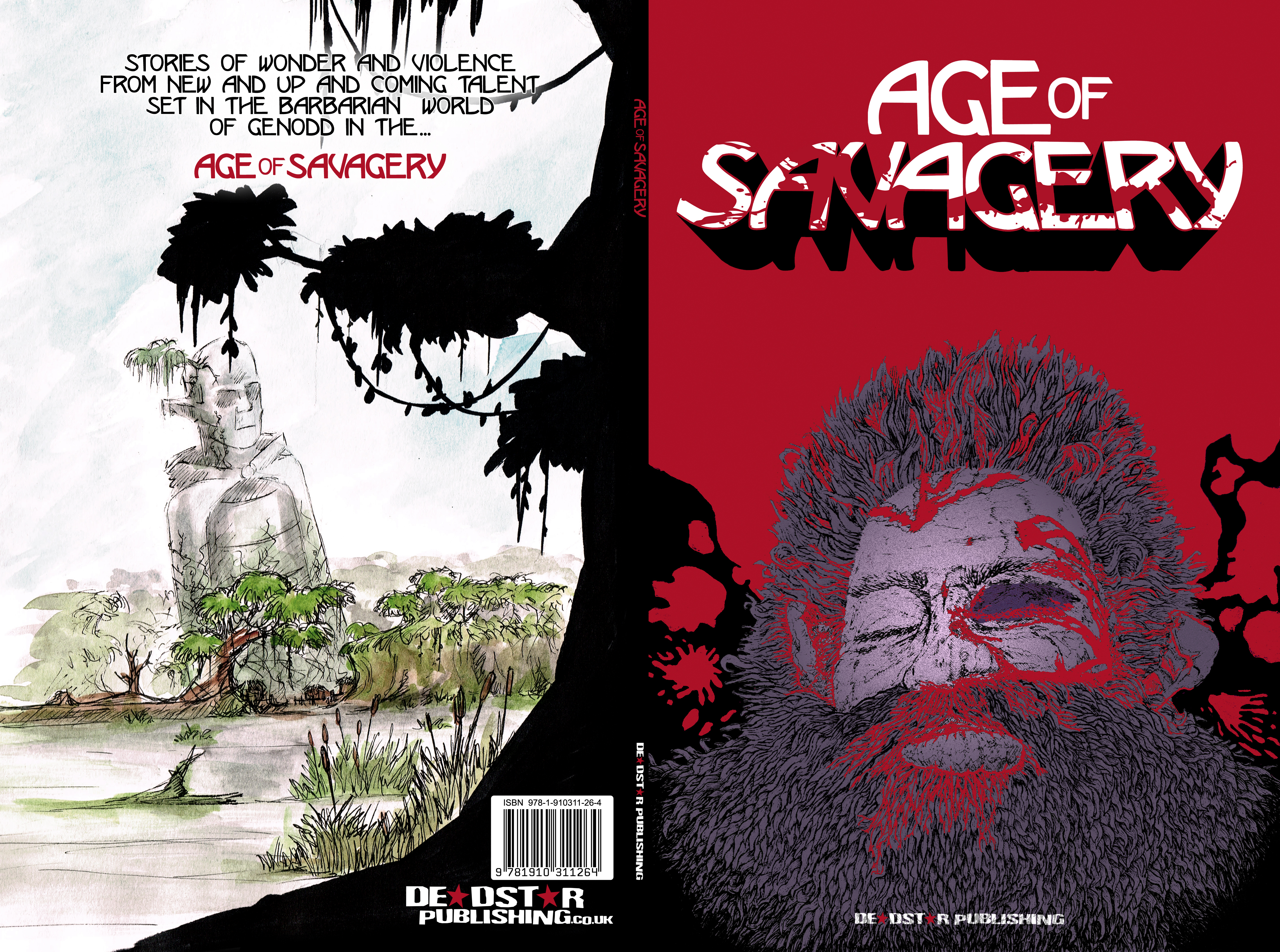
With Age of Savagery due to be released in a week’s time, we thought it might be interesting to go over how we got to the final cover image. Cover design can be a tricky thing and is often best achieved through progression in steps with improvements and tweaks along the way. The cover progression of Age of Savagery led to this:
It didn’t always look this polished though. At first, we had an internal planning session where we tried to decide on the character and composition of the piece, as well as considering artists whose work might complement the style we were looking for. In the end we went with John Johnston.
The initial sketch:
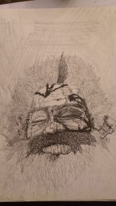
The image we selected was one of a bloodied face to represent the harshness of the world. We hadn’t finished going through submissions at that point, but already knew there were going to be multiple stories featuring different characters in each so we wanted something that didn’t directly reference any one story but instead gave an idea about the world. We tried various colour permutations (two of which are below) as well as adding a crossed pair of weapons over or behind the face.

After considering our options we chose a blood-red background and from there we were able to start looking at title design options. We’ve found in the past that having a logo for the title allows us to use it in multiple ways (posters, advertising, different editions)… but what kind of logo did we want for Age of Savagery? David Powell, who came up with the original concept, had rejected an initial mock-up that riffed off the likes of One Million Years B.C. (1966) in favour of something a bit sleeker.

Designing the logo
In the end, we developed and iterated through a number of options…
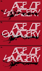
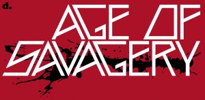

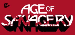
D was a marked improvement over the first three – it was far easier to read and had some interesting shapes to it, but it still didn’t feel right to us. E was an attempt to change direction and bring some different influences in. We generally liked it, but agreed within the team that it was a little plain. Eventually, we came to G. With this, we think we hit the mark. It’s bold, eye-catching, and keeps the theme we were aiming for: an idea that something noble and elegant still exists but which is now besmirched by violence.
A few minor changes to the cover image (like highlighting the face so it didn’t seem so flat) and the front cover was finished!
Onto the back cover…
From there we could focus on the back cover. By this point, the idea of the Monuments (great structures left behind by the Eldar races) had become a firm part of the project and many of the submissions referenced them in one way or another so it made sense to reflect that on the back cover. David Powell produced the art and Danny J. Weston then worked some major with colour to produce these:
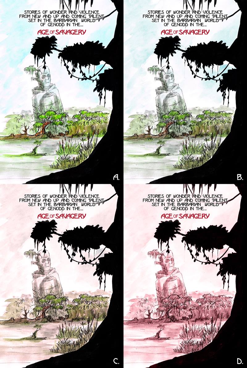
Quickly, we discounted D as being uninteresting – the muted colour drained the energy out of the colour. C was similarly discounted for looking miserable. We ditched A because we felt that it took things too far in the other direction, looking too cheerful a place… but the tone of B was just right for what we were looking for. You can also see the advantage of having a logo that can be modified in size/positioning for a title as that allowed us to highlight the title on the back page. With the addition of our logo and barcode, the back cover was complete. We were pleased at the contrast between front and back cover and how overall the images tied together.
Hopefully, you agree that it’s a cool looking cover and this breakdown has given you an insight into how our covers come to be. Age of Savagery is available now through our webstore – or you can pick it up at conventions, and it will be available on request from all good book and comic stores.