Posted on

The Comic We Almost Couldn’t Publish – Dexter’s Half Dozen: The Stone Child

In 2008, a full two years before Deadstar Publishing was founded, two creators plucked up the courage to start putting out their own comic that was half-way between the A Team and Hellboy. That comic was Dexter’s Half Dozen – and the first storyline released was that of The Stone Child.
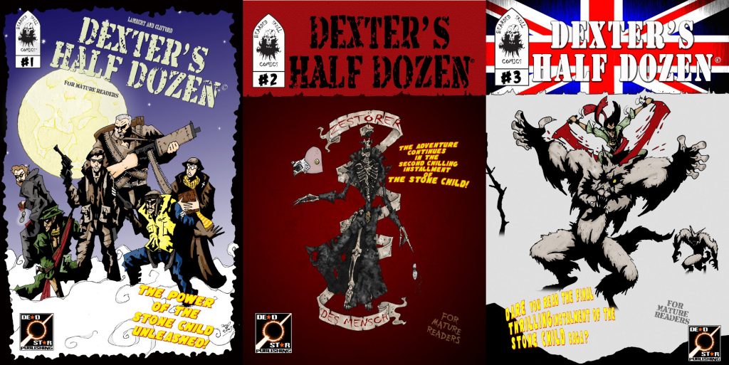
Original covers for the first arc of Dexter's Half Dozen

Fast forward to now, David Clifford and Jamie Lambert have completed ten issues – nine in main continuity and a bumper length one shot tenth-anniversary special. The next issue is underway and we’ll give you more information about that one when it comes closer to release.

Ever since we started publishing Dexter’s Half Dozen we’ve wanted to offer The Stone Child as a combined edition but life has a funny way of interfering with plans. Just about everything that could go wrong has gone wrong – we blew up a computer, Jamie and David blew up a computer, somehow all the original art files became corrupted… for a while it looked like things were never going to come together!

Why is this edition of Dexter’s Half Dozen so important to us?

Not long after we began publishing Dexter’s Half Dozen we sat down for a chat with David and Jamie and discussed some of the strengths and weaknesses of the comic. We love the storyline – it’s exceedingly well written and the team behind it have tried to keep it as historically accurate as possible (while accounting for demons, liches, zombies etc!) right down to the reference material of tanks and weapons used. Where it fell down in the first few issues though was David’s lack of practice with the medium so far. By the time they reached issue #5 David had settled into a style that suited the story perfectly… but the first few issues lacked… something.

They agreed. And they wanted to improve the comic so David went (literally) back to the drawing board to add shading and texture to every page, bringing the first three issues up to the same fantastic standard as the later issues. In some cases he redrew the art from scratch to make use of his greater experience of sequential storytelling at that point. This would all be great… and if things had gone to plan we’d have released this collected edition in 2014 or 2015. As you have already read though, things didn’t go to plan.

What went wrong?

We don’t know when it happened, and we’ll never know why it happened but at some point all of the revamped artwork files became corrupted. This was discovered after David and Jamie blew up their computer and they tried reverting to backups. Every page was affected and it seemed for a long time like the idea of releasing a deluxe edition of Dexter’s Half Dozen: The Stone Child was dead in the water.

That was until Danny stepped in. We had just launched Dolphin Squad II: A Death in the Pod, Danny’s second graphic novel, and David had a bonus story in there. When the two of them were discussing their respective works, Danny offered to take a look at the files to see if there was anything he could do to repair them. And there was!

In Danny’s Words

Hi, this is Danny. I’ve been Deadstar’s Art Director since 2010 and originally I was asked to step in to re-letter the series to make it easier to read. I’ve ended up adding a lot more than that though. We decided to re-letter the series after it was rejected by Comixology due to non-standard lettering.
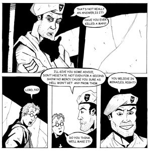
Original artwork from issue 1 of Dexter's Half Dozen

The original edition artwork. 2008.

The image above shows original black and white artwork from issue #1. At the time the Dexter’s team had limited experience creating comics using computers so the lettering was done the old fashioned way. The script was printed, cut out and glued to the original artwork pages. This lead to some of the lettering looking a little rough in places and hard to make any changes if mistakes were noticed in the future.
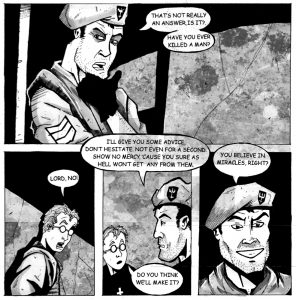
Updated but corrupted image from issue 1 of Dexter's Half DozenThe updated artwork (corrupted). 2014.

By issue #5 of the original Dexter’s Half Dozen run it was decided that the artwork in future issues should be fully rendered in greyscale rather than the black and white line work seen in the first four issues. Artist, David Clifford went back to the original inked pages and, using a combination of traditional media and computer, fully rendered the first 4 issues and even redid a few pages from scratch. The characters and foreground elements were painted by hand with background textures and shading done on computer. The process took many months but, just has the project was nearing completion, David’s computer crashed and all the work was lost!

The files were eventually recovered from a back up but unfortunately they were corrupted. Lines appeared across much of the artwork and background textures were missing so much data they appeared entirely wrong if they loaded at all. The plans for the collected editions were put on hold.

Danny's attempt to fix corrupted pages from Dexter's Half Dozen

Updated artwork (slightly less corrupted). 2018.

As I was already looking at the original 2008 files with a view to re-lettering them I asked David for access to the 2014 files to see if there was anything I could do. I was expecting to have to completely recreate David’s work by greyscale rendering each page from scratch – but after some experimenting I found that by saving the images as a PDF document before opening them in Photoshop the corrupted backgrounds could be fixed. The lines still remained but they could be repaired with a relatively simple but time consuming process. The image above is the result of that process.
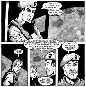
Fully revamped art for Dexter's Half Dozen: The Stone ChildFinal TPB artwork and lettering. 2018.

Whilst repairing the corrupted artwork I also finished the background rendering on several pages that weren’t completed at the time the files were backed up. I was able to put my knowledge and experience to good use with several techniques to duplicate the same style and make my pages look as close as possible to David’s. Along with the artwork I re-lettered the entire collected edition using an updated script from writer, Jaime Lambert.

The cover

Now that you know the trouble we’ve gone to in getting Dexter’s Half Dozen: The Stone Child ready for release in its deluxe collected edition, it’s time for the cover reveal.
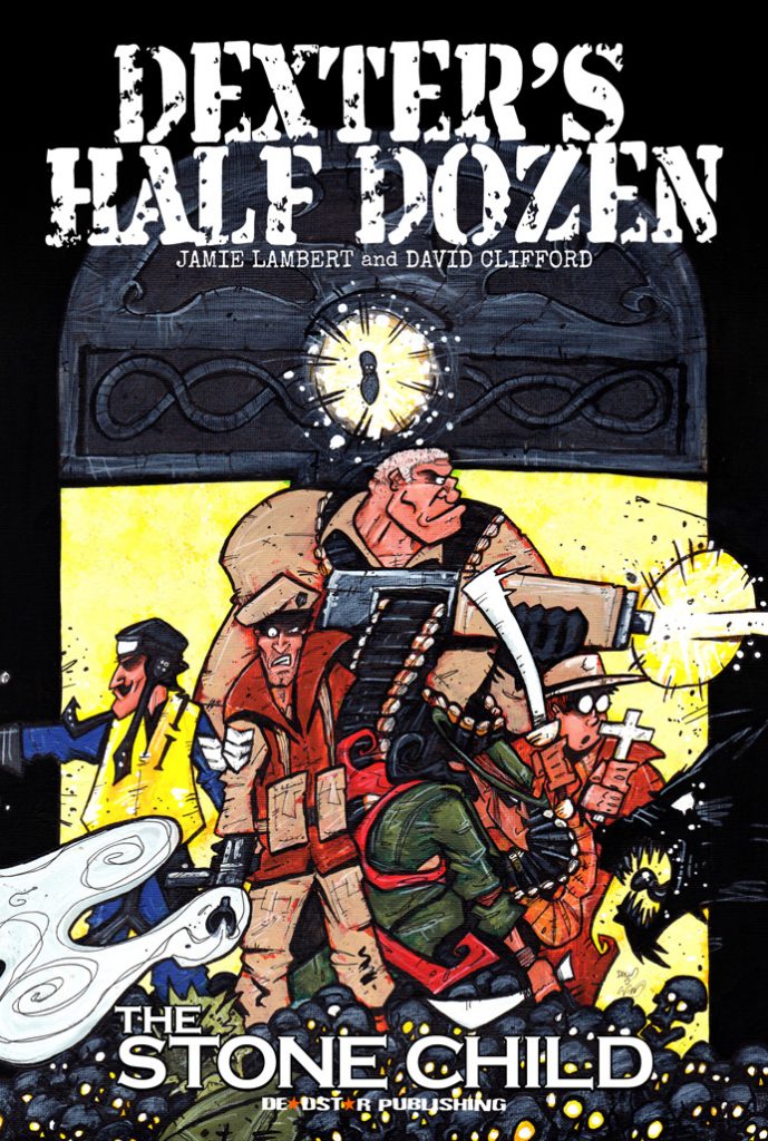
Tada!

And here’s the reverse:
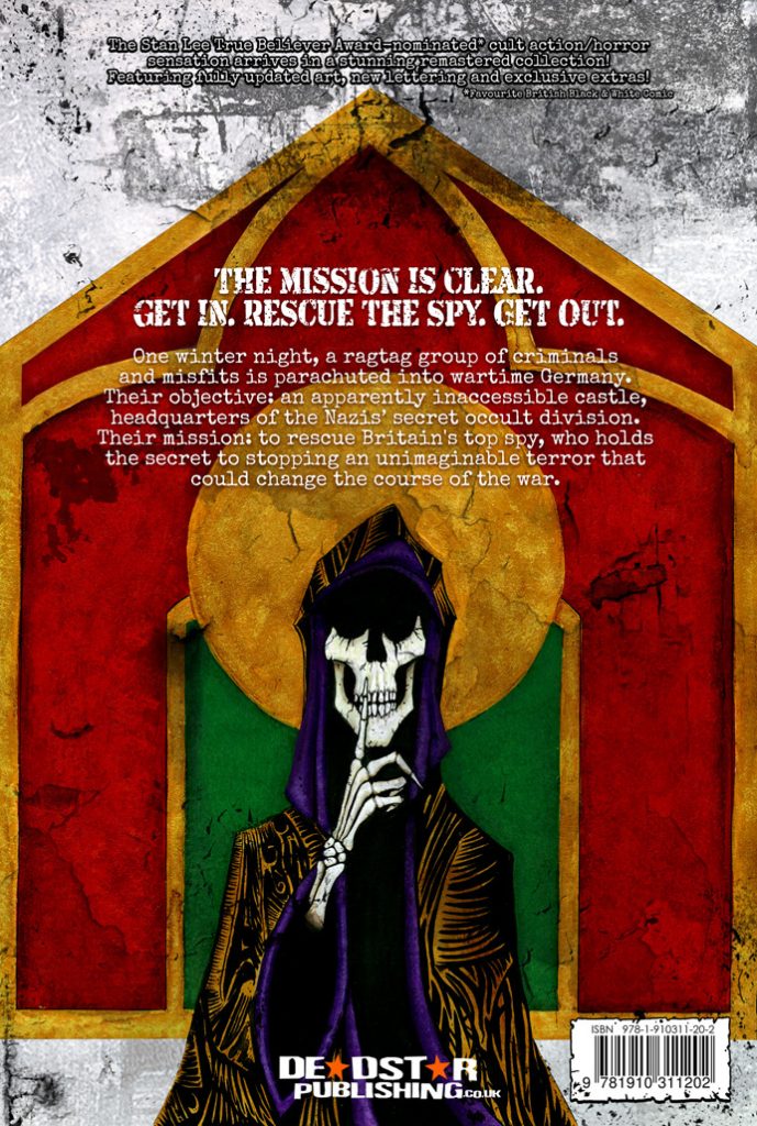
What’s in it?

As well as the complete story of The Stone Child, this edition also contains original sketches and concept art, the first ashcan used to promote the series, a pin up by Alex Ronald and will feature a foreword by Barry Nugent, Editor-in-Chief at Geek Syndicate. In total, Dexter’s Half Dozen: The Stone Child is 100 pages long and will be released at the True Believer’s Comic Festival in Cheltenham on February 2nd 2019. You can pre-order it now by visiting our store or by asking your local comic store to order it for you.

Posted on

7 Shades – A Brand New Comic From David Clifford and Peter Rogers

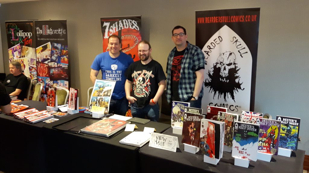
Last Saturday we attended the Cardiff Independent Comics Expo and had the pleasure of being joined by the creative team behind 7 Shades and Dexter’s Half Dozen.


The creative teams behind 7 Shades and Dexter's Half Dozen
The creative teams behind 7 Shades and Dexter’s Half Dozen

To the left is Peter Rogers, author of the Eagle-nominated anthology series Eleventh Hour as well as many other things. In the middle is David Clifford, artist behind both Dexter’s Half Dozen and 7 Shades – and to the right is Jamie Lambert, writer for Dexter’s Half Dozen.

When we were approached with the concept for 7 Shades we were immediately intrigued. It was described to us as a supernatural western, and having already seen the art for Dexter’s Half Dozen we were sure that David could do the theme justice. And he has.

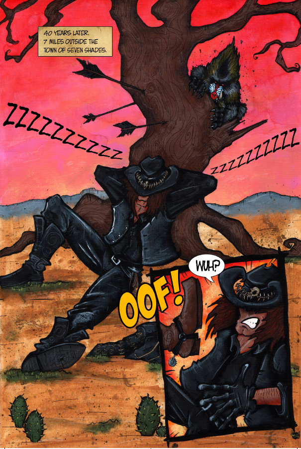
Each page is fully painted art and looks gorgeous… as you can see here:

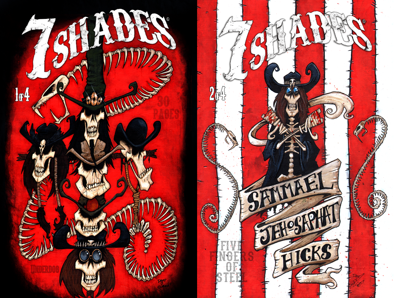
The story revolves around events occurring in the mysterious town of 7 Shades. The man you see being rudely awakened in the page above is our protagonist, Sammael Jehosephat Hicks, and he – with the rest of his family are on a quest to save his sister. Sammael is a pretty unreliable individual and to put your faith in him for something crucial is probably a bad idea. To say much more would spoil a story that ought to be read – and you can start that journey here! Below are the covers for issue 1 and 2. The series will be released in arcs and the concluding part of this arc will be released September 2018.


One of the things that Peter and David are keen to do is to have a Q&A page in each issue starting from issue 3. If you’ve got a question you’d like them to answer, you can email us or contact them through their own website.

Posted on

Cover progression for Age of Savagery

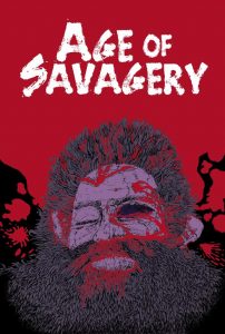
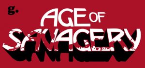
This is the final front and back cover to the book.

With Age of Savagery due to be released in a week’s time, we thought it might be interesting to go over how we got to the final cover image. Cover design can be a tricky thing and is often best achieved through progression in steps with improvements and tweaks along the way. The cover progression of Age of Savagery led to this:

This is the final front and back cover to the book.
This is the final front and back cover to the book. (click it to see it in full view)

It didn’t always look this polished though. At first, we had an internal planning session where we tried to decide on the character and composition of the piece, as well as considering artists whose work might complement the style we were looking for. In the end we went with John Johnston.

The initial sketch:

This was the initial sketch from which the cover emerged.

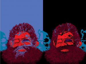
The image we selected was one of a bloodied face to represent the harshness of the world. We hadn’t finished going through submissions at that point, but already knew there were going to be multiple stories featuring different characters in each so we wanted something that didn’t directly reference any one story but instead gave an idea about the world. We tried various colour permutations (two of which are below) as well as adding a crossed pair of weapons over or behind the face.

After considering our options we chose a blood-red background and from there we were able to start looking at title design options. We’ve found in the past that having a logo for the title allows us to use it in multiple ways (posters, advertising, different editions)… but what kind of logo did we want for Age of Savagery? David Powell, who came up with the original concept, had rejected an initial mock-up that riffed off the likes of One Million Years B.C. (1966) in favour of something a bit  sleeker.

Designing the logo

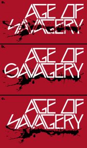
In the end, we developed and iterated through a number of options…

A and C were rejected on readability grounds. C was better but we thought it didn’t really keep with the savage nature of the theme – it was too futuristic.

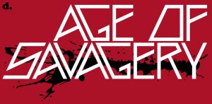
D was a marked improvement over the first three – it was far easier to read and had some interesting shapes to it, but it still didn’t feel right to us. E  was an attempt to change direction and bring some different influences in. We generally liked it, but agreed within the team that it was a little plain. Eventually, we came to G. With this, we think we hit the mark. It’s bold, eye-catching, and keeps the theme we were aiming for: an idea that something noble and elegant still exists but which is now besmirched by violence.

A few minor changes to the cover image (like highlighting the face so it didn’t seem so flat) and the front cover was finished!

Onto the back cover…

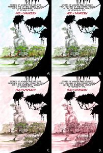
From there we could focus on the back cover. By this point, the idea of the Monuments (great structures left behind by the Eldar races) had become a firm part of the project and many of the submissions referenced them in one way or another so it made sense to reflect that on the back cover. David Powell produced the art and Danny J. Weston then worked some major with colour to produce these:

Back cover options for Age of Savagery
Back cover options for Age of Savagery (click to enlarge)

Quickly, we discounted D as being uninteresting – the muted colour drained the energy out of the colour. C was similarly discounted for looking miserable. We ditched A because we felt that it took things too far in the other direction, looking too cheerful a place… but the tone of B was just right for what we were looking for. You can also see the advantage of having a logo that can be modified in size/positioning for a title as that allowed us to highlight the title on the back page.Final back cover artWith the addition of our logo and barcode, the back cover was complete. We were pleased at the contrast between front and back cover and how overall the images tied together.

Hopefully, you agree that it’s a cool looking cover and this breakdown has given you an insight into how our covers come to be. Age of Savagery is available now through our webstore – or you can pick it up at conventions, and it will be available on request from all good book and comic stores.

Posted on

Life is expensive

© Creative Commons Zero (CC0) via ID 96918400 | Dreamstime Stock Photos

I don’t think it can be denied that life is expensive – every year costs go up a little bit for this, or that, or something else. For us, unfortunately, it’s time to do the same. After 8 years in business we’re introducing our first price rise.

© Creative Commons Zero (CC0) via ID 96918400 | Dreamstime Stock Photos

What’s changing?

When Deadstar first started in 2010 we set our prices based on what we felt was fair based on what we’d seen on the market and what we felt comfortable spending to build our own collections, so our graphic novels were set at around £10, and our single issues of comics were either £3.75 if they were in colour, or £3.00 in black and white.

Over the past few months though it’s become apparent that we can’t sustain those prices in face of rising costs – so from May 1st 2018 we will be raising prices on some of our products. An example of that is Dolphin Squad II (oops… spoilers) which will retail for £11.99 instead of the £9.99 price that we released the first book for. Likewise, our colour comics will rise from £3.75 to £4.50 and our black and white comics will go from £3.00 to £3.50 each.

Why are we telling you about this price rise now?

With our prices having stayed the same for eight years we felt our loyal customers deserved to know in advance to give you the best possible opportunity to buy any last items missing from your collection at the old price.

We selected the new prices based on the same criteria we looked at in 2010: what other people in the community are charging, and what we’re happy to spend on similar products. We hope that despite this price rise you’ll feel our titles are still good value for money.

Is there anything that won’t be affected?

As things stand, we aren’t looking to increase the cost of our ebooks. Some publishers price their ebooks at the same rate as their physical releases on the basis that the same amount of work went into their production… while we feel that’s true, there’s no stock costs associated with ebooks. Once they exist, they will always be there and there’s no need to manage print costs, postage, table hire and travel to sell them… so we prefer to keep our ebook prices as low as possible.

If our rising costs have put you off buying a physical book or comic from us, at least take solace from the thought that, comparatively, it will now be cheaper than ever to start that ebook collection!

Hopefully, we won’t have to make another announcement like this until 2026!

Posted on

Deadstar’s Expo List 2018

2018 is promising to be a big year for Deadstar. We have Age of Savagery, Dolphin Squad volume 2, Dexter’s Half Dozen issue 10 and more releasing over the next few months.

This list will continue to grow as we confirm more dates. For now, you can find us at the following:

February 3rd – True Believers Comic Festival, Cheltenham
May 5th – Swansea Comic and Gaming Convention, Swansea
May 12th-13th – Cardiff Film and Comic Con, Cardiff
May 25th-27th – MCM London, London
June 2nd – Cardiff Independent Comic Expo, Cardiff
June 9th – Caerphilly Comic Con, Caerphilly
July 27th-29th – London Film and Comic Con, London
August 5th – True Believers Summer Variant, Gloucester
August 12th – Frome Comic Con, Frome *Unable to attend*
August 18th – Manchester Comics and Reading Festival, Manchester
September 15th – ICE, Birmingham
September 22nd-23rd – Cardiff Film and Comic Con, Cardiff
September 22nd-23rd – Thought Bubble Festival, Leeds
October 6th – DragonDaze, Newport
October 26th-28th – MCM London, London
November 10th – Bristol Horror Con, Bristol *Show cancelled*
November 24th-25th – MCM Birmingham, Birmingham *Unable to attend*
December 1st – Turn Left, Cardiff


Posted on

Talking about BitCoin

BitCoin doesn't really look like this... but it's a cool visual.

I know what you might be thinking, “BitCoin? I thought you were a publisher?!”

We are. Our focus is on producing (and selling) the best books, comics and graphic novels we can.

“Right… and how’s that related to BitCoin?”

BitCoin doesn't really look like this... but it's a cool visual.
BitCoin doesn’t really look like this… but it’s a cool visual.

We’ve found over the years that our audience tends to fall towards the geekier side of things. When you’re selling titles about sentient zombies, second world war occult terrors and crime-fighting dolphins that’s not too much of a surprise. Along with that, we like exploring new things and trying innovative technologies.

A few years ago we experimented with a service called Pay With A Tweet; its purpose was fairly simple: to increase visibility of a product through social sharing. We decided to trial it because at the time we were giving away a free sample of an upcoming title as a way of promoting the finished product – but that alone doesn’t bring much traffic to a website. If nobody knows you have something cool available then no one will come seeking it out. What we liked about Pay With A Tweet was that we still got to give away that free sample, but in return each person that downloaded it was prompted to share a message to their followers on Twitter letting them know that they too could see the freebie.

Trying new things

Our hope with it was that – like today’s viral marketing – it would lead to huge amounts of organic traffic (for those of you that don’t read advertising blogs… that means getting visitors to your site without having to pay for advertising). To an extent, it worked. We didn’t get tens of millions of people downloading the freebie sample… but enough saw it that when the book came out we were more than happy with how it sold.

Bringing things back to BitCoin… it’s a technology that we’ve followed on and off for a few years, and which has recently exploded into the mainstream. BitCoin is a “decentralised virtual currency”; it has no tangible representation like pound coins or dollar bills, and isn’t issued by any one nation. Think of it as being a bit like money in a PayPal account – you can still earn it, spend it, exchange it for other currencies etc. And by now you might be guessing where we’re going with this…

That’s right: Deadstar Publishing can now accept payment in BitCoins using BitPay as a payment processor. It’s something we considered as far back as 2015, but our old e-commerce setup didn’t support it, and at the time it was possibly too niche an idea for even our geeky (and non-geeky) fans to use over other choices. Now though, it’s widely enough used that it would be foolish not to try it out.

Is BitCoin the future?

On that front, we have no idea. At the moment though, BitCoin is growing in popularity (and with that, it’s growing in value) and – as you might expect – we want to make it as easy as possible for people to buy cool things from us. To that end, you can consider this our next experiment!

Posted on

Brand new website

A new site for 2017

Yesterday marked the debut of our brand new website. This is the third complete iteration of our site – and hopefully the best so far.

We originally decided back in 2015 that our old site, which we’d built in-house in 2011 first as a collection of static HTML pages then in 2013 rewrote into a semi-modular php template system, wasn’t up to scratch anymore. At the time, we’d looked to outsource the design and implementation of the site so that we could focus on what we do best: publishing great books and comics. Alas, it wasn’t to be, and by the end of 2016 we’d decided to bring development in-house again. As it was a task that would require quite a bit of time for us to complete we put it on the back burner until August this year when we were able to lock in many of the features and design choices that we wanted to implement.

Our 2011-2015 website design

Above, you can see our old design… and it’s one that we really liked at the time. It had a lot of issues though – firstly, the homepage was information about us… which is great… but from looking at our site analytics we found that most people who entered the site via the homepage would read it then leave. However, if they entered the site from our Submissions page or our Store then they were much more likely to either contact us, or buy something from us. With that in mind, we’ve changed the homepage into the store so that more people can see our products.

Another issue we had was that there were too many options for pages within the site… and a lot of the pages either contained duplicate information… or it was out of date. On the top menu alone there were 9 options to choose from (and there were buttons on the left and right of the screen as well as a second menu at the bottom of the screen. Far too many options!). We’ve now reduced that to 5 (plus your account, basket and checkout buttons) which means the site is easier to navigate.

On top of that, when the old site was written, phones and tablets were used far less for internet browsing so we never really optimised our site for mobile web users. That has changed and our site is now responsive based on your connection and screen size.

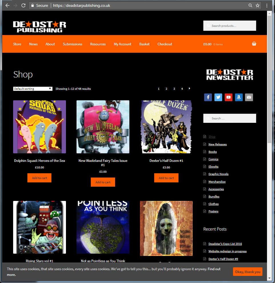
We’ve also taken the opportunity to update our logo. Danny did a fantastic job when he designed the Deadstar Publishing nameplate in 2010… but over time we’ve begun to see its limitations – the transparent eroded and damaged letters don’t always hold up well against different colours so we came up with the slightly simplified two-tone version that we’re using across all of our titles from now on.

All of that has lead to the following:

A new site for 2017
A new look for 2017

I hope you’ll agree that the new site looks a lot cleaner than the old one. It’s easier to navigate and more clearly displays our products and their categories. It also does two other things that the older version never did: we’re now compliant with recent EU and UK legislation requiring websites to advise their customers about the use of cookies. Another detail is that we’ve moved over to SSL technology to secure your information even more.

It hasn’t been the smoothest of moves though – originally we had planned to make the new site live on Tuesday 19th September… and when we started the process of migrating data from our test server… something went wrong. Fortunately, we have some very good, clever and nice friends, and Mark Chatterley, the big cheese behind In Ear Entertainment (who incidentally produced and sell our audiobook for Not as Pointless as You Think) was able to help us recover and ensure our work over the past few months didn’t go to waste.

Now that our new site is up and running, there’s still a bit of tinkering to do… but for now, happy browsing!